Shanshui City

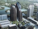
Chinese firm MAD recently has unveiled new images of Chaoyang Park Plaza – a complex of skyscrapers, office blocks and public spaces modelled on the mountains, hills and lakes depicted in Chinese landscape paintings – which is now under construction in Beijing. Located on the southern edge of Chaoyang Park in Beijing’s central business district, the 120,000-square-metre development will create a mix of commercial properties, office blocks and residential accommodation inspired by the landscapes depicted in traditional Chinese shanshui paintings. It marks another milestone in one of the practices of MAD ’s design theory. This project pushes the boundary of the urbanization process in modern cosmopolitan life by creating a dialogue between artificial scenery and natural landscapes.
“By transforming features of Chinese classical landscape painting, such as lakes, springs, forests, creeks, valleys, and stones, into modern ‘city landscapes’, the urban space creates a balance between high urban density and natural landscape,” said the studio. “The forms of the buildings echo what is found in natural landscapes, and reintroduces nature to the urban realm.” Chaoyang Park Plaza will become one of MAD’s first built projects to demonstrate studio founder Ma Yansong’s ongoing Shan-Shui City concept – an urban strategy named after the Chinese words for mountains and water.
For the centre of the site, MAD has designed a pair of 120-metre skyscrapers with striated volumes intended to reference images of rock formations. These will be accompanied by four office blocks, modelled on depictions of river stones, and two residential courtyard buildings designed to recreate “the freedom of wandering through a mountain forest”. Like the tall mountain cliffs and river landscapes of China, a pair of asymmetrical towers creates a dramatic skyline in front of the park. Ridges and valleys define the shape of the exterior glass facade, as if the natural forces of erosion wore down the tower into a few thin lines. Flowing down the facade, the lines emphasize the smoothness of the towers and its verticality.
“Flowing down the facade, the lines emphasize the smoothness of the towers and its verticality. The internal ventilation and filtration system of the ridges draw a natural breeze indoors, which not only improves the interior space but also creates an energy efficient system.”
Landscape elements are injected into the interiors of the towers to augment the feeling of nature within an urban framework. The spatial organization provides occupants with the feeling of moving through a mountain forest a 17 meter-tall courtyard lobby connects the paired towers, envisioned as a valley. The site and sounds of flowing water make the entire lobby feel like a natural scene from a mountain valley. Flowing water moves through the volume, while at the summit, public gardens offer a different perspective of the lower plain created by the shorter buildings on the site. The spatial organization provides occupants with the feeling of moving through a mountain forest.
At the top of the towers, multi-level terraces shaped by the curving forms of the towers are public gardens where people can gaze out over the entire city and look down at the valley scene created by the lower buildings on the site.
Full content of this issue you can read here
The full version of the article can be read in our printed issue, also you can subscribe to the web-version of the magazine
 Materials provided by MAD Architects


