Jenga Skyscraper
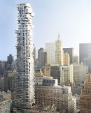
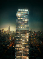
60-storey skyscraper 56 Leonard Street located in lower Manhattan Tribeca, which construction to be completed this year, looks very similar to the assembled tower from the popular children’s board game “Jenga”. Does Leslie Scott, who in the 70s of the last century came up with this game, could imagine that her ideas after almost half a century will be embodied in the architecture? The project of “Jenga” (the nickname given the skyscraper by locals) was designed almost ten years ago by famous architectural firm Herzog & de Meuron.
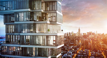
The project is conceived as a stack of individual houses, where each house is unique and identifiable within the overall stack. A careful investigation of local construction methods revealed the possibility of shifting and varying floor-slabs to create corners, cantilevers and balconies – all welcome strategies for providing individual and different conditions in each apartment. At the base of the tower, the stack reacts to the scale and specific local conditions on the street, while the top staggers and undulates to merge with the sky. In-between, the staggering and variation in the middle-levels is more controlled and subtle, like in a column shaft.
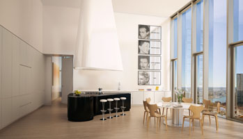
To break-up the tendency towards repetition and anonymity in highrise buildings, 56 Leonard Street was developed from the inside-out. The project began with individual rooms, treating them as “pixels” grouped together on a floor-by-floor basis. These pixels come together to directly inform the volume and to shape the outside of the tower. From the interior the experience of these pixels is like stepping into a series of large baywindows.
The strategy of ‘pixelating’ rooms also happens in section, creating a large number of terraces and projecting balconies. While careful to avoid directly overlooking a neighbouring apartment, these outdoor spaces provide indirect visual links between people – maybe strangers – who share the building. Aggregated together, these houses-in-the-sky form a cohesive stack, a vertical neighbourhood, somewhat akin to New York’s specific neighbourhoods with their distinctive mix of proximity and privacy in equal measure.
The top of any tower is its most visible element and, in keeping with this, the top of 56 Leonard Street is the most expressive part of the project. This expressiveness is driven directly by the requirements of the interior, consisting of ten large-scale penthouses with expansive outdoor spaces and spacious living areas. These large program components register on the exterior as large-scale blocks, cantilevering and shifting according to internal configurations and the desire to capture specific views, which ultimately results in the sculptural expression of the top.
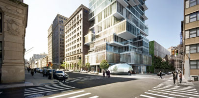
Meanwhile, the base of the tower responds to the special character of Tribeca. This is a part of New York characterized by a wide range of building scales - from small townhouses to large industrial blocks and the ubiquitous high-rise buildings of downtown. By grouping together ‘pixels’ of various sizes, including lobby, parking decks and housing amenities, the tower reflects and incorporates each of these neighbourhood scales.
The overall appearance of the tower is very much a result of accepting and pushing to the limit simple and familiar local methods of construction. As a volume, the building has extreme proportions – at the very edge of what is structurally possible – and given its relatively small footprint, is exceptionally tall and slender.
The building also shows its structural ‘bones’ and does not hide the method of its fabrication underneath layers of cladding. Instead, exposed horizontal concrete slabs register the floor-by-floor stacking of the construction process and exposed insitu concrete columns allow the scale of the structural forces at work to be experienced from within the interior. The system of staggering, setbacks and pixelation is further animated through operable windows in every second- or third- façade unit. This unusual feature for high-rise buildings also allows occupants to directly control fresh air intake.
Herzog & de Meuron


